Vouch
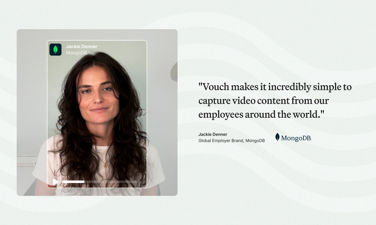
Vouch is an early-stage tech startup founded in Sydney in 2021 — the leading video-first AI content platform for talent teams, working with global brands like Warner Bros Discovery, Stryker, GoDaddy and MongoDB.
I joined in 2022 and inherited a brand in transition. Some elements had quietly been retired; what remained was a typeface, a palette used with extreme caution, and a lot of product imagery. My job was to build something coherent and credible from those parts — and then keep building as the company grew.
Finding the visual language
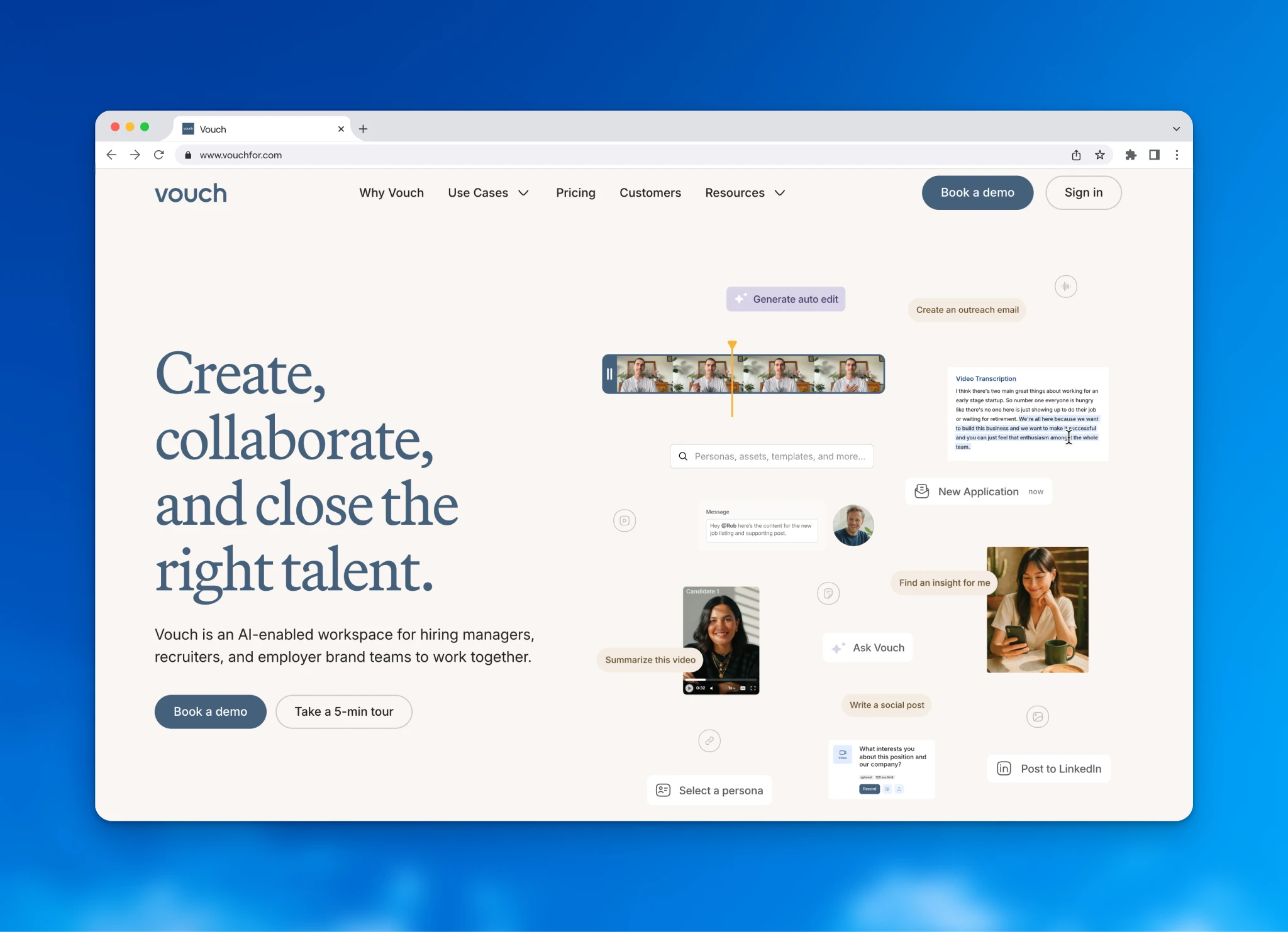
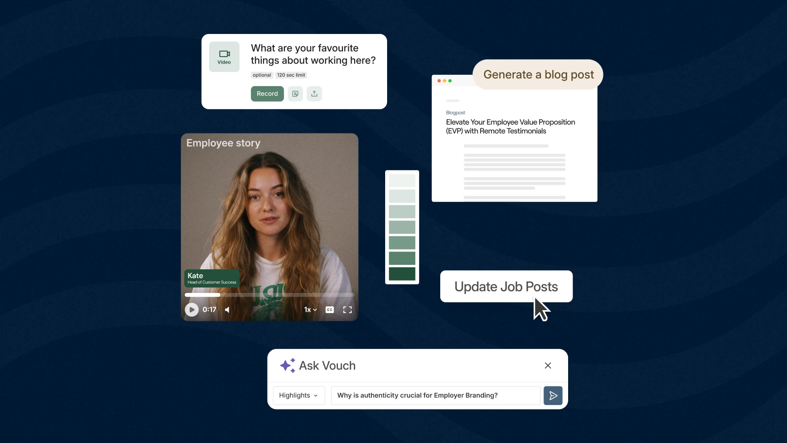
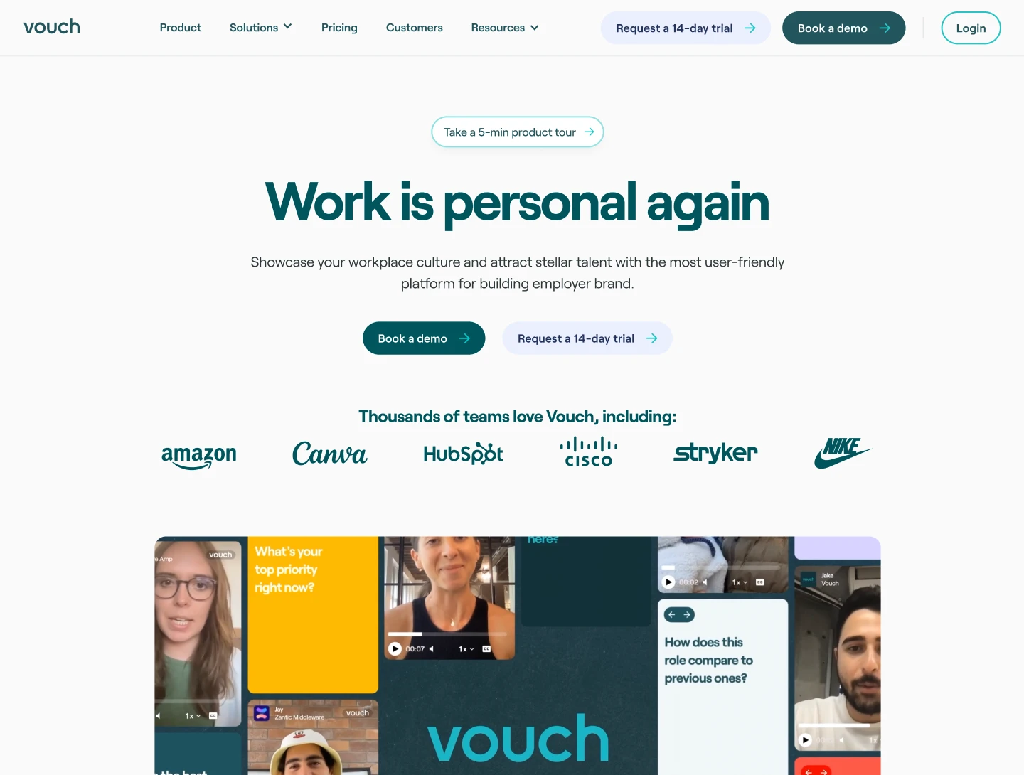
The first real test was a major product section on the website: around 75 images for a video platform, without repeating the same visual idea over and over. One piece from that period still runs today — a full-screen masonry of videos, all playing simultaneously, cascading in. It started as an experiment updating a LinkedIn header. It became a key hero visual because it did exactly what Vouch needed to do: show what the product captures, and put people first.
Animations became one of our most reliable tools — combining video and motion graphics to show the product in action. For major feature releases I planned, produced and sometimes scored these myself.
The first rebrand
Late 2023, the brand needed to evolve. After speaking with agencies, we decided to do it in-house. The existing palette — pinks, reds, crimsons — felt heavy and no longer right. We had underused secondary teals, and I started exploring those. When our CEO came in with a photo of three Uniqlo caps — off-white, light teal, a slightly darker teal — that became the palette.
I extrapolated a system from those three colours and transposed it through Figma to the website. The new palette gave me considerably more room: we introduced an expanding circular motif, updated the animation style, and things started to feel like us. That identity served us well for eighteen months.
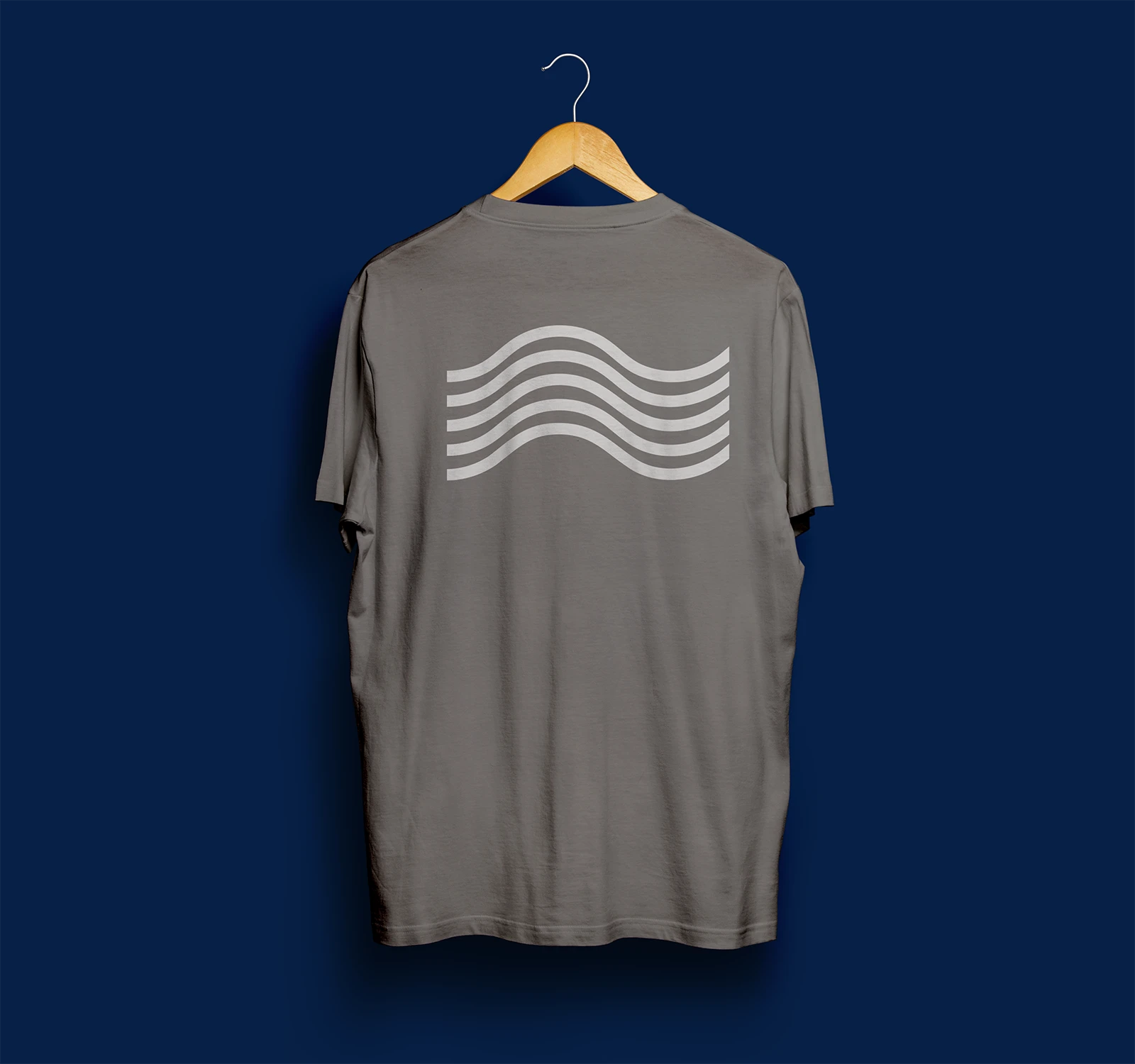
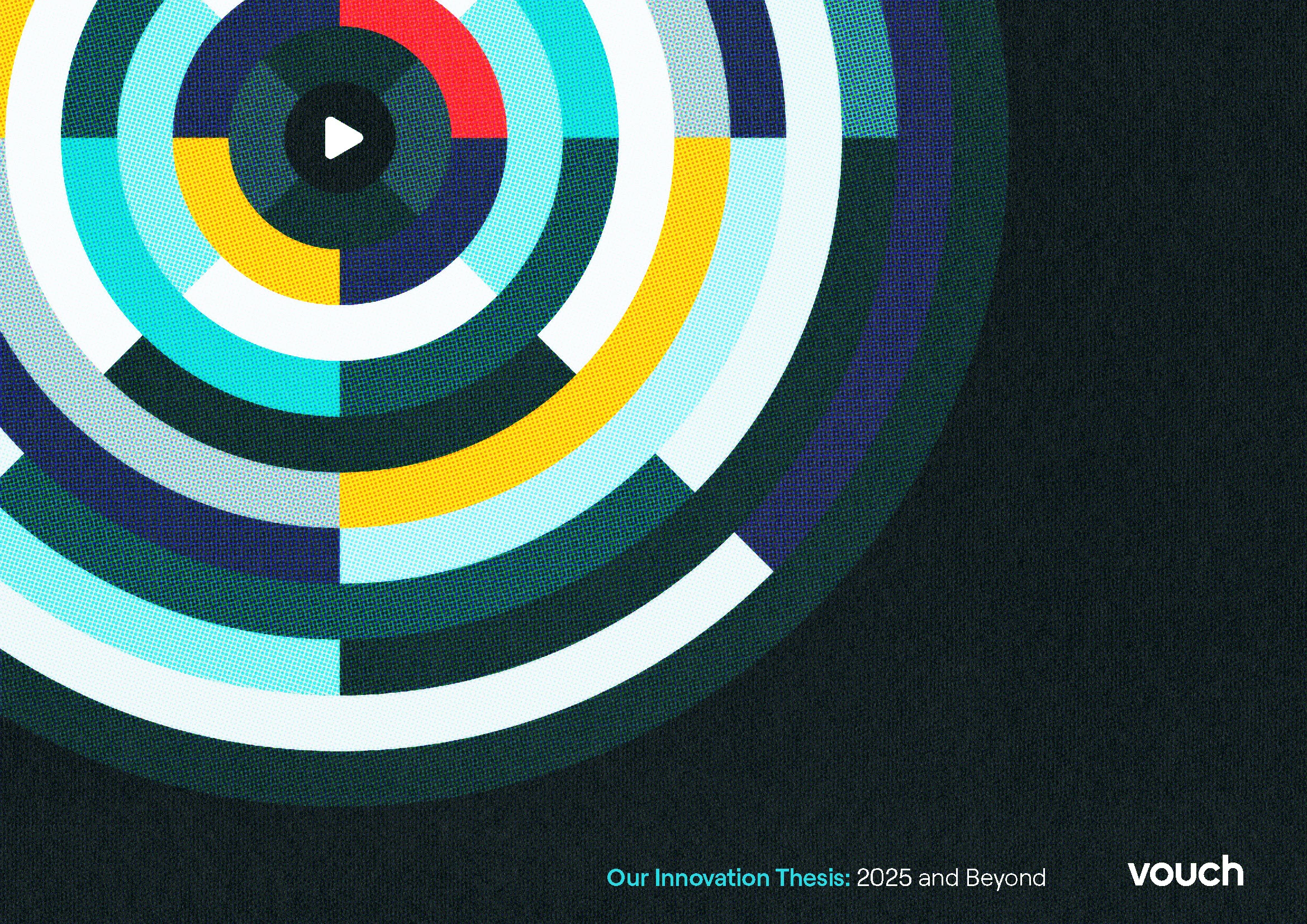
The 2025 rebrand
When a major product extension created the opportunity for another look at the brand, I set myself a specific brief: create something more defensible. Companies in this space had converged on similar visual identities — some had borrowed whole layouts from our website. We shared a typeface with half the internet. I wanted to move away from that, and away from the generic feel of tech.
After some verbal brainstorming I landed on something I described internally as a "surf flow state." We're a Sydney company. Nobody in the office really surfs. It felt slightly on the nose, but it was the most accurate shorthand for what I was after: something coastal, spacious, decaffeinated — that quality of flow that Vouch is designed to give you in your work.
The key material decision was texture. I applied film grain overlays throughout — not for nostalgia, but to give digital surfaces some tangibility. I referenced specific film stocks to adjust image levels, giving the photography a sense of familiarity you can feel without being able to name. With no time or budget for a shoot, I used AI image generation — Visual Electric, with a set of references and prompts I'd developed and trusted. Around 90% of what came out was more than fit for purpose, and all of it got the grain treatment.
I produced a full set of vector icons and shapes designed to look hand-drawn rather than geometric. A wave motif emerged that we ended up using everywhere. The whole thing launched alongside the new module. Again, entirely in-house.
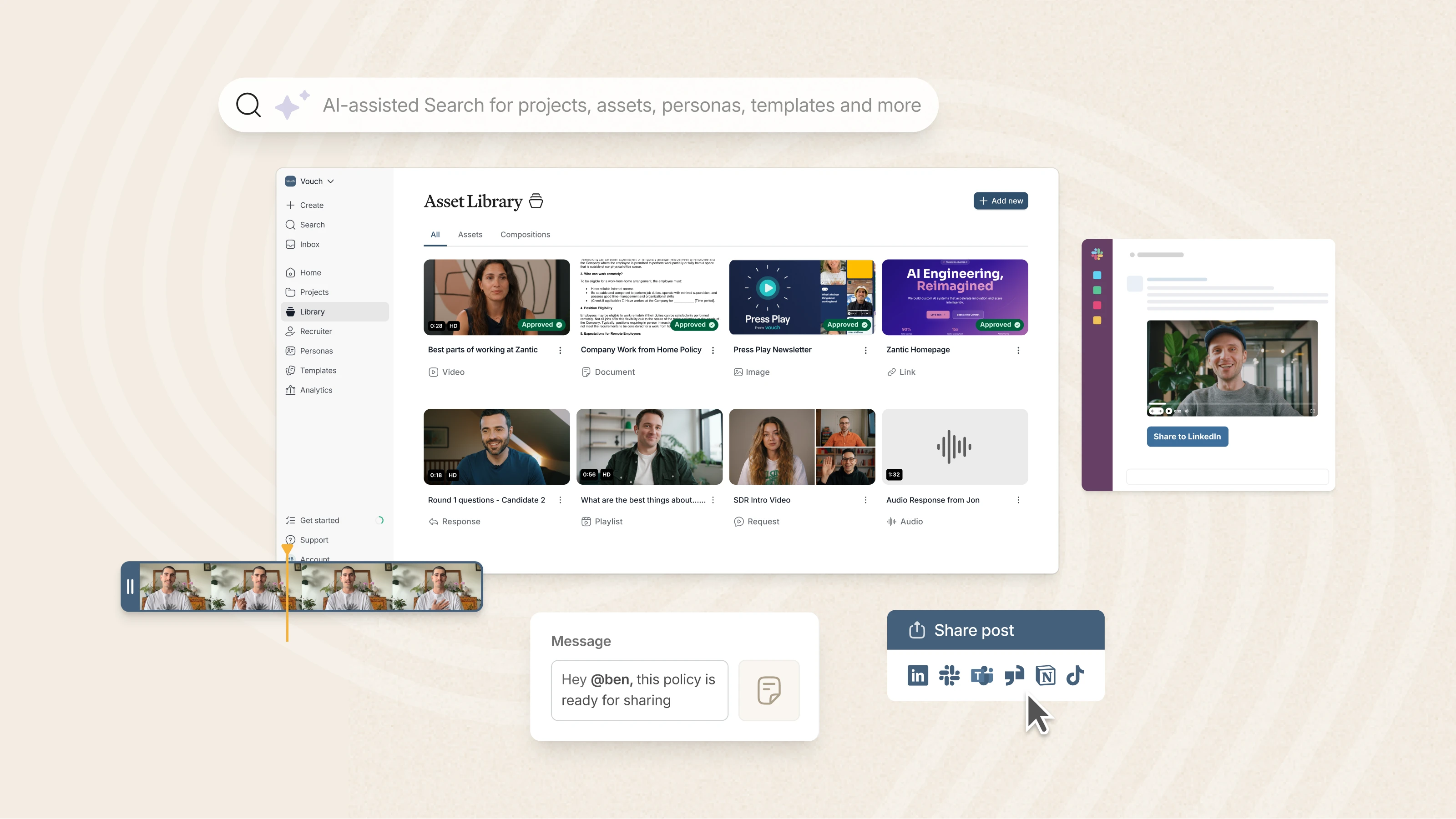
The website
Across three years I designed — or redesigned — almost every page of the Vouch site. Homepage, feature pages, case study templates, campaign landing pages. Each rebrand meant a full pass in Figma: working out how the new identity would function at scale before it touched a browser.
The build sat with a Webflow development agency I worked closely with throughout. My job was to design with enough specificity that they weren't making decisions that should have been mine — component structure, spacing logic, responsive behaviour. Over time that relationship sharpened how I design for the medium, and structured handoffs in a way that made the gap between design and build as small as possible.
Working with AI
Alongside the rebrand work, I built an internal Brand Hub — a centralised, interactive guidelines resource with a conversational AI interface that I named Flow. Rather than a static PDF that nobody opens, it's a tool anyone in the team can actually talk to: ask it a question about the brand, get a useful answer. It made brand knowledge accessible in a way a document never quite manages.
Building it required me to understand how these tools work not just as a user, but as someone shaping the output. That turned out to be useful beyond the hub itself. AI is now a genuine part of how I work: accelerating early ideation, offloading repetitive execution, generating photography where a shoot isn't an option. I try to use these tools the way you'd use any good collaborator — knowing when to trust them and when to push back. The goal is always the same: better work, made faster, without losing the thinking that makes it worth anything.
The shape of the role
Working at an early-stage startup means being the person who holds the creative standard across everything — not just the flagship launches, but the full breadth of what a growing company needs. That means being close enough to the brand to move quickly without losing coherence, and being the kind of creative lead who makes it possible for others to contribute ideas and see them realised well.
I also brought significant video and audio production experience into the role — stepping in on editorial decisions, sound, AI-assisted editing — and managed external content creators producing for Vouch's channels. Writing briefs that are tight enough to protect the brand without flattening a creator's voice is a different skill from internal briefs, and one I've developed deliberately.