Postman Jack Identity
Postman Jack is a startup in Sydney, looking to sell clothes and accessories branded by suburb.
I worked with them to clarify their brand mission - products that represent a neighbourhood with a sense of that place and the people.
With that in mind, I steered away from any overtly postal imagery (which was suggested at first) to avoid the name becoming confused with any delivery service.
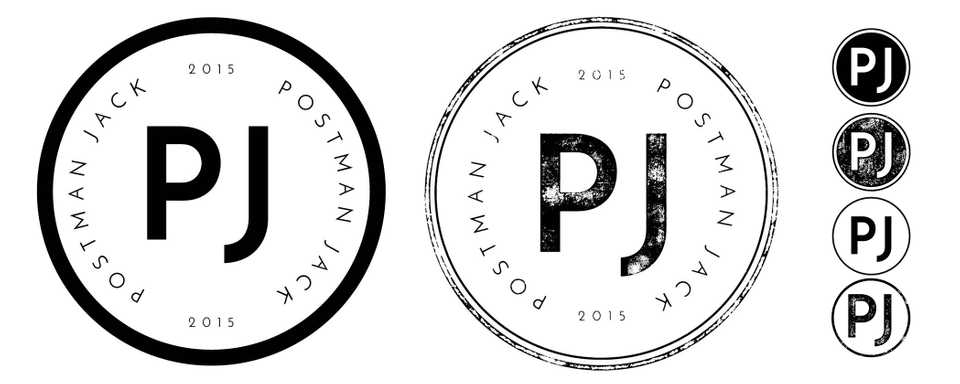
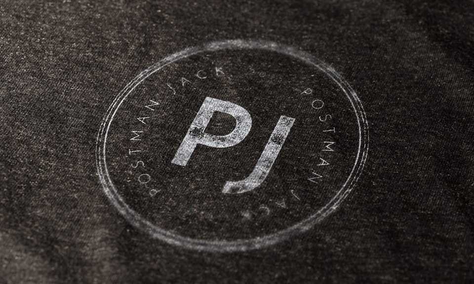
I landed on the postmark as the concept for their primary identity images and system, and they were thrilled. The postmark stamp communicates where the item comes from and threw open multiple potential approaches to take.
I created two sets of assets; a clean set and also a set with a print like texture to mimic the stamp found on a letter or package.


![]()

Redfern Concept
After completing the master brand for Postman Jack, I wanted to contribute further to the project and design branding for one of the Sydney suburbs they were planning to use. I opted for Redfern, a suburb with a colourful history and at the time my home of four and a half years.
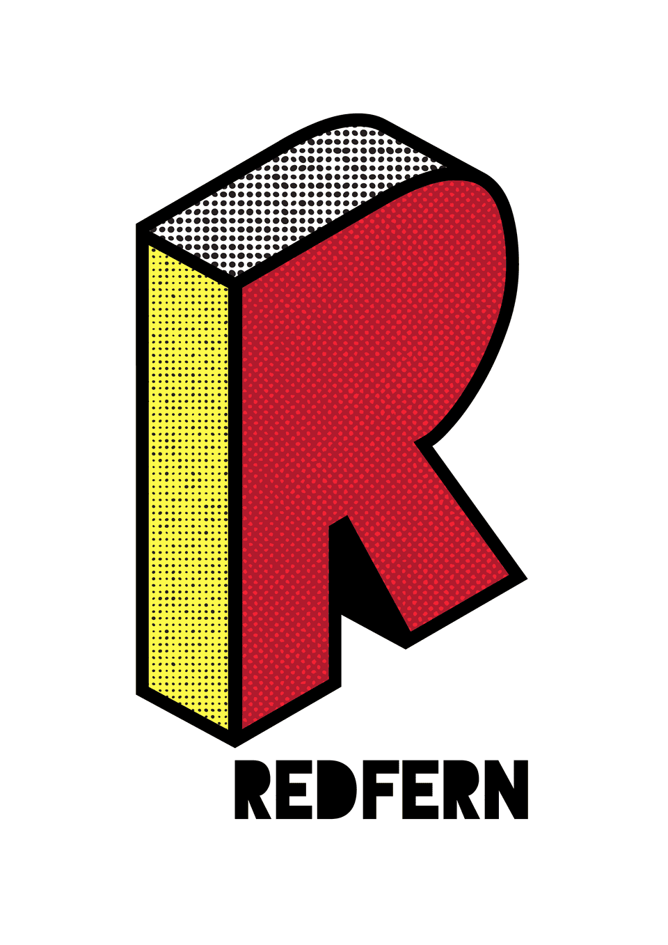
I couldn’t ignore the Aboriginal history of the suburb, so the colours were decided from the start; Red, Black and Yellow. After trying several ideas and approaches, I found that two of my favourite styles worked for me in this project - isometric and halftone.
Using the letter R, I created an isometric version which would allow me to apply the three colour palette to the visible planes of the letter.
Using halftone to apply the colour brings energy and the pattern I used was more organic than geometric circles, which contrasts nicely with the clean lines of the R shape.

