Postman Jack
Postman Jack is a Sydney startup with a simple premise: clothes and accessories branded by suburb. I worked with them as a freelance brand designer to develop the identity from the ground up.
Identity
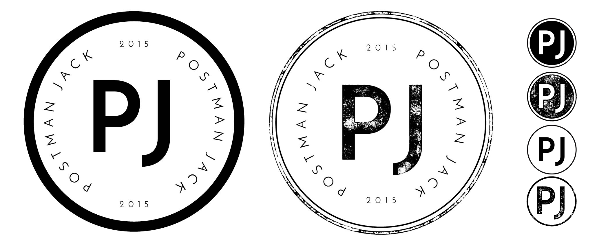
The first thing we did was clarify the brand mission — products that represent a neighbourhood with a sense of that place and its people. With that established, I steered away from postal imagery, which had been the initial suggestion. The risk was obvious: anything too literally postal reads as a delivery service. Instead I landed on the postmark — it communicates where something comes from, carries the right associations, and opened up multiple directions from there.
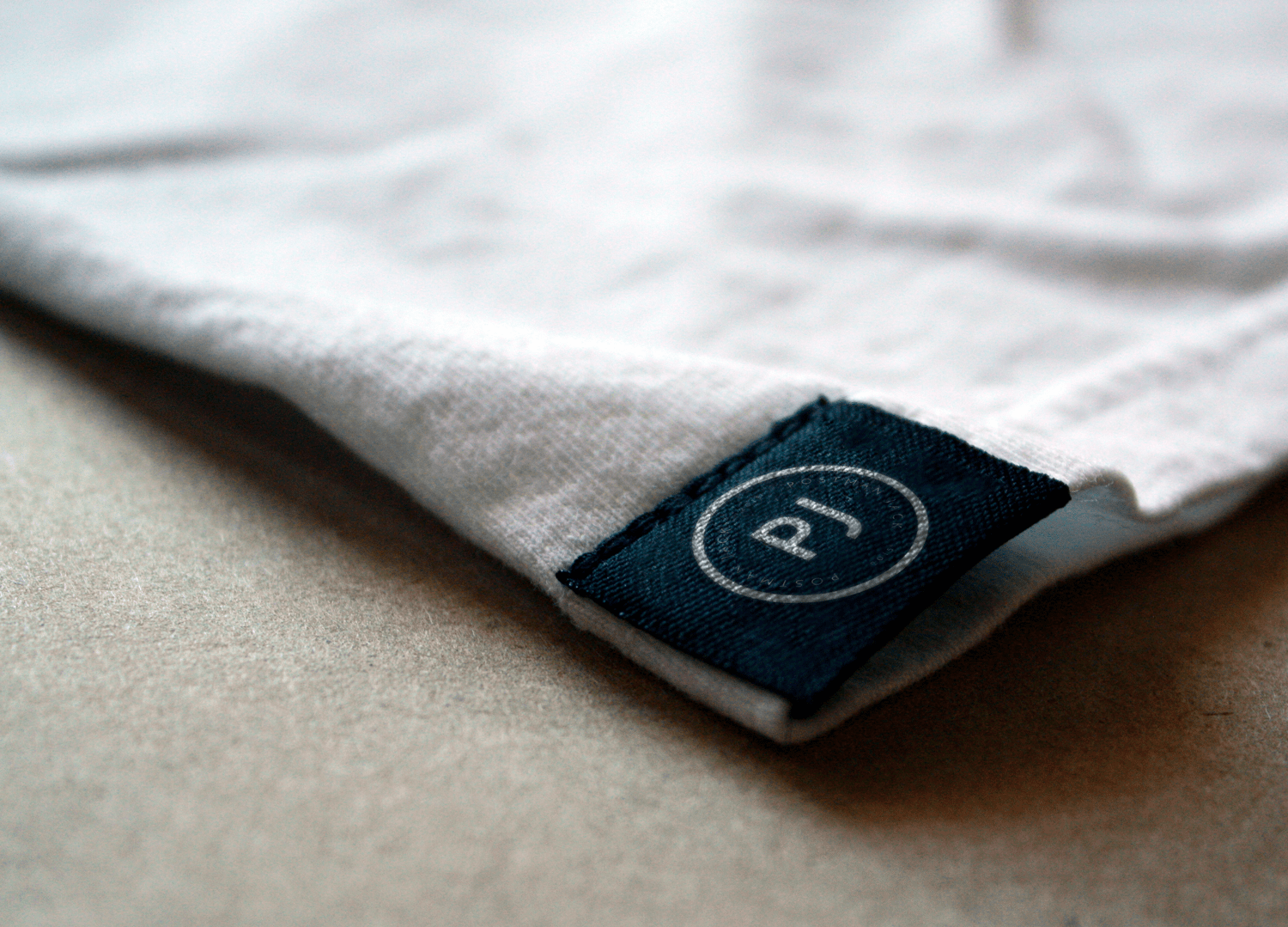
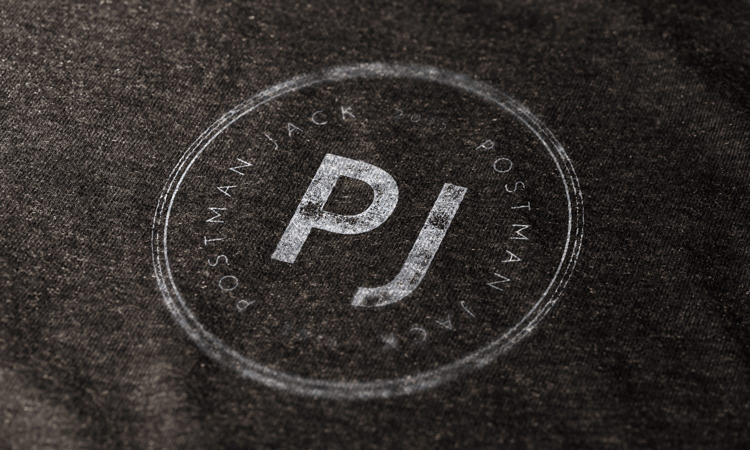
I created two sets of assets: a clean version and one with a print-like texture mimicking the stamp found on a letter or package. They were thrilled.
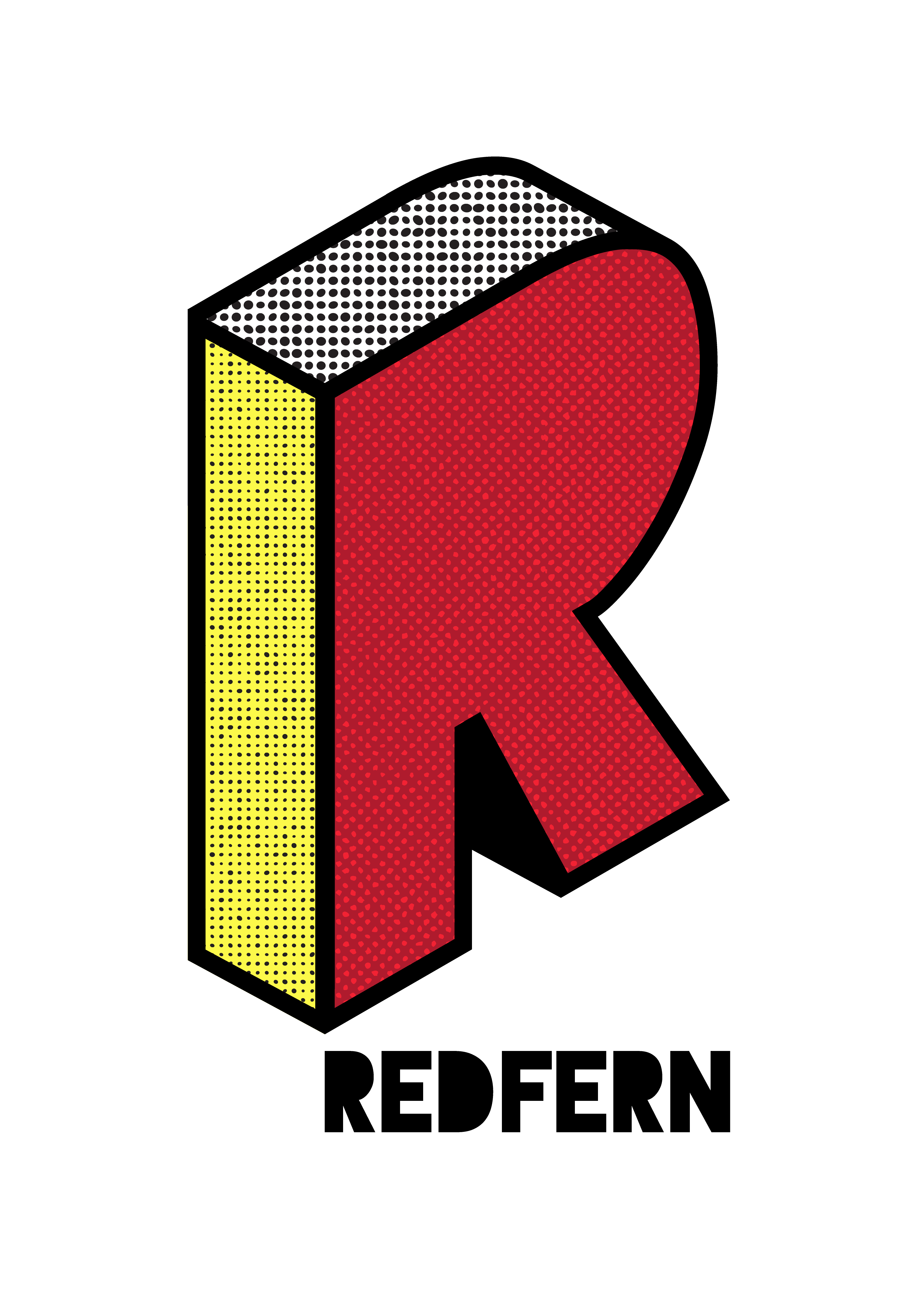
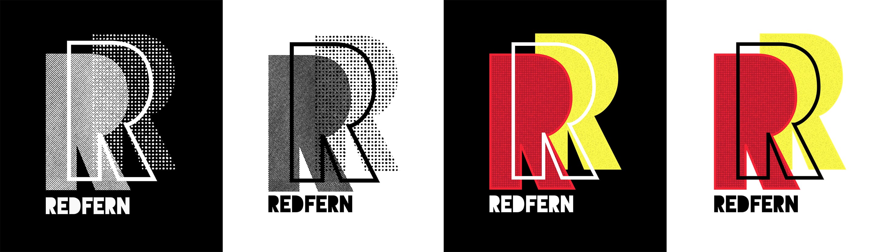
Redfern
After completing the master brand, I wanted to go further — designing branding for one of the suburbs they were planning to use. I chose Redfern. It's a suburb with a colourful history, and at the time it had been my home for four and a half years.
The Aboriginal history of the area made the colour palette a straightforward decision: red, black and yellow. Two of my favourite techniques — isometric and halftone — both turned out to work well here. Using the letter R, I built an isometric form to apply the three colours across its visible planes. The halftone pattern I chose was more organic than geometric, which sits well against the clean lines of the R shape.