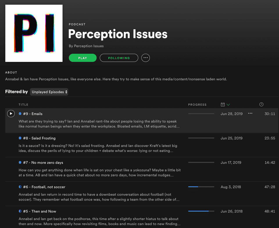
Perception Issues is a nascent and sporadic podcast and blog, of which I am a co-founder and host.
It’s taken a few different forms and meanings over-the-years and attempts to unravel how we all see the world differently from where we are in time and space.
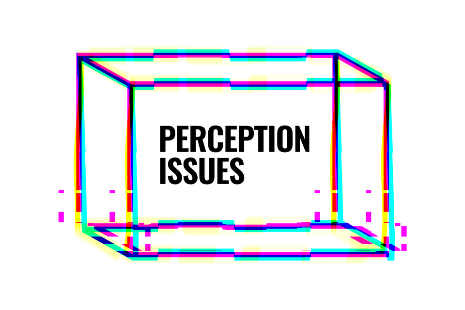
The identity uses a visual perception illusion from the 19th century called a Necker Cube. With no visual cues as to its orientation, it can be interpreted to have either the lower-left or the upper-right rectangle as its front side.
I love visual illusions, and this worked in such a simple way. It visually represents how something can be seen differently by other people, which tied in perfectly with what Perception Issues is about.
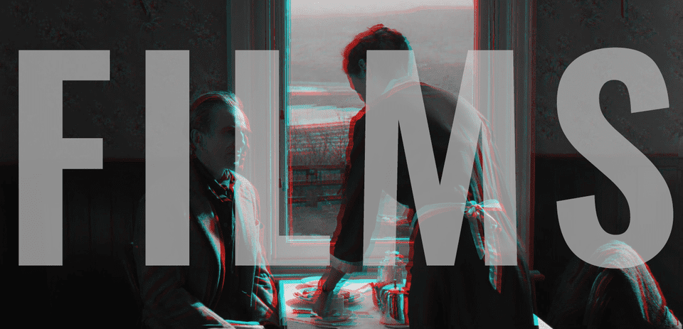
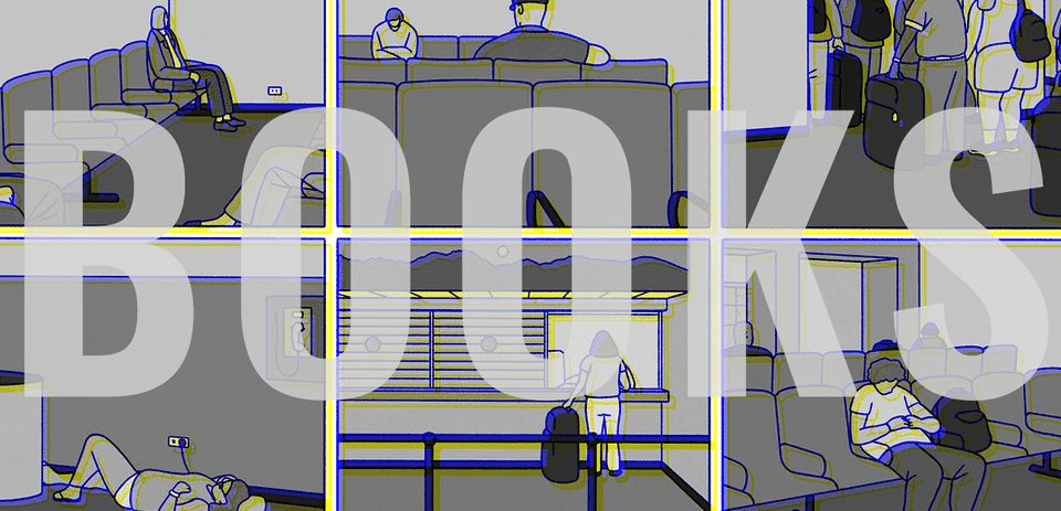
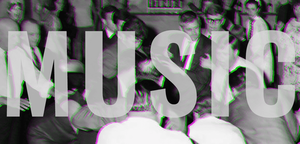
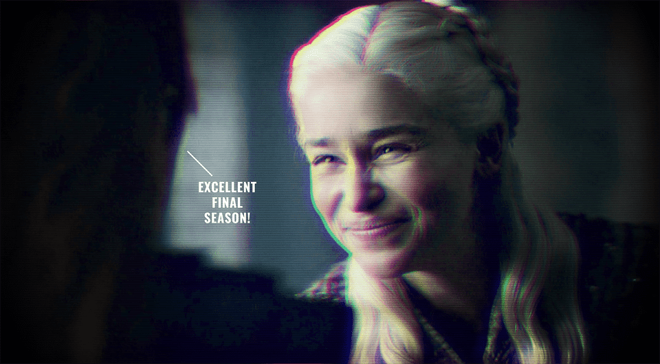
I added a glitch and chromatic aberration treatment to add some colour and randomness to the brand visuals, but also to give us a style we could apply to imagery to make it ours and fit with the brand when appearing on the website.
