
Dept. of Planning and Environment
The Department of Planning and Environment is the NSW Government agency responsible for land use, planning policy, and environmental outcomes across the state. I worked there as a Senior Brand Designer in 2020, across brand, identity, and print.
ACLIP identity
This is my favourite project from that period — one with an authentic story at its centre.
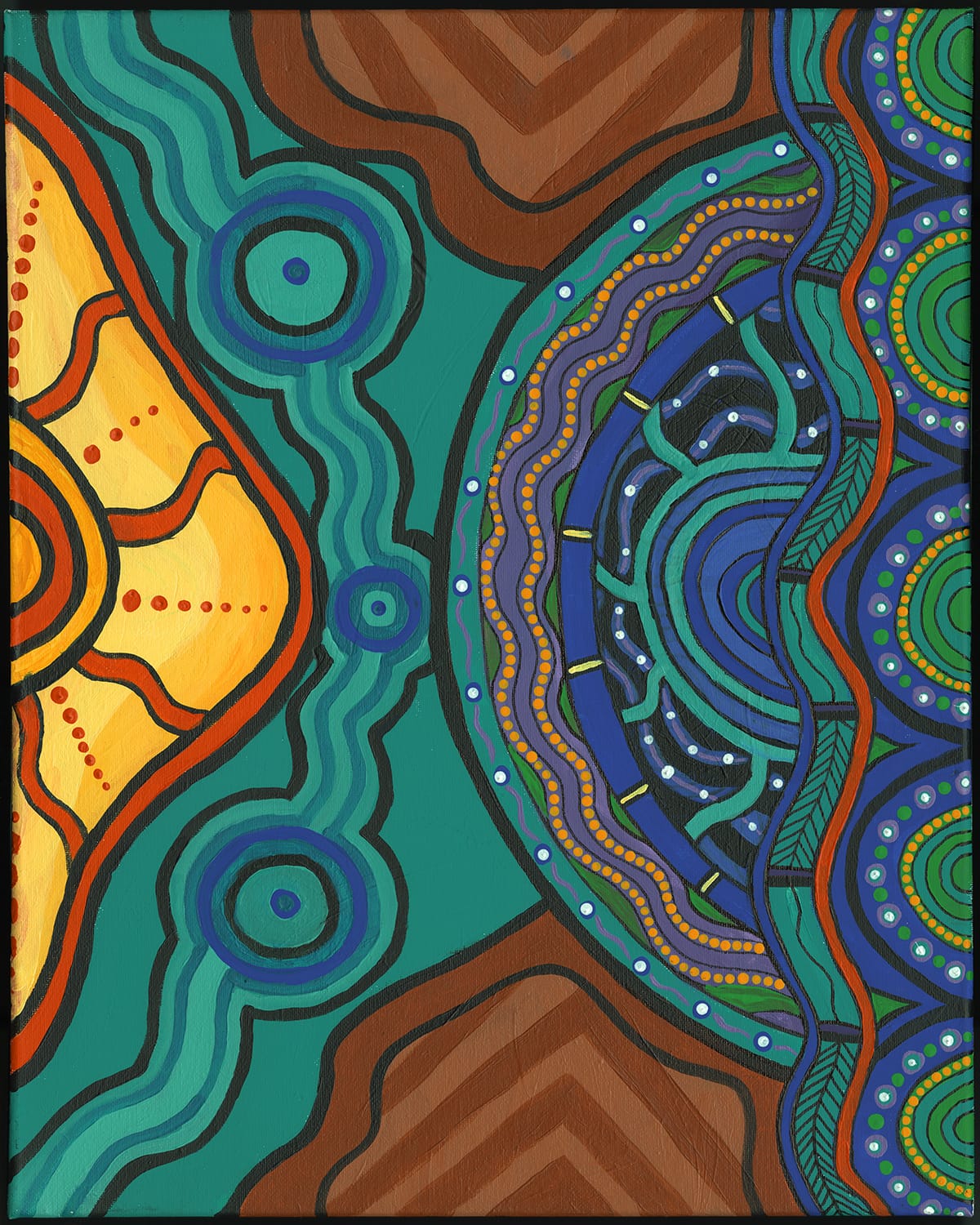
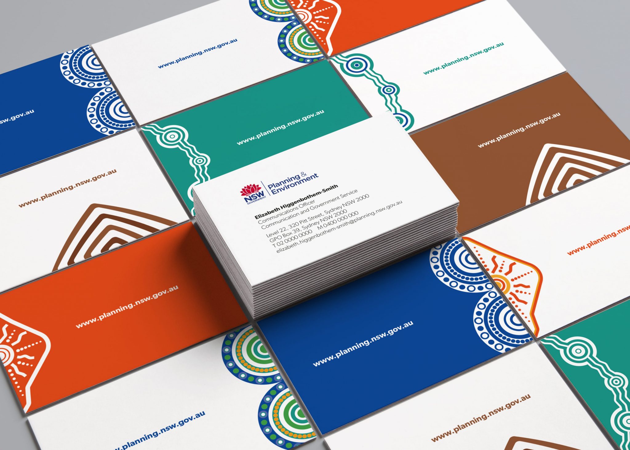
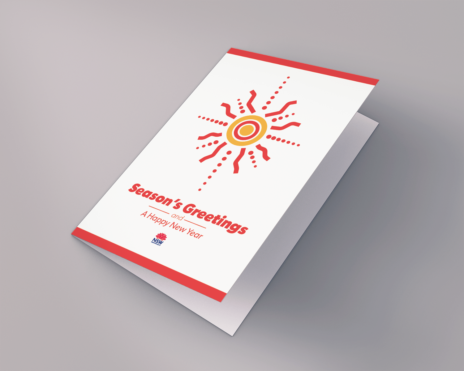
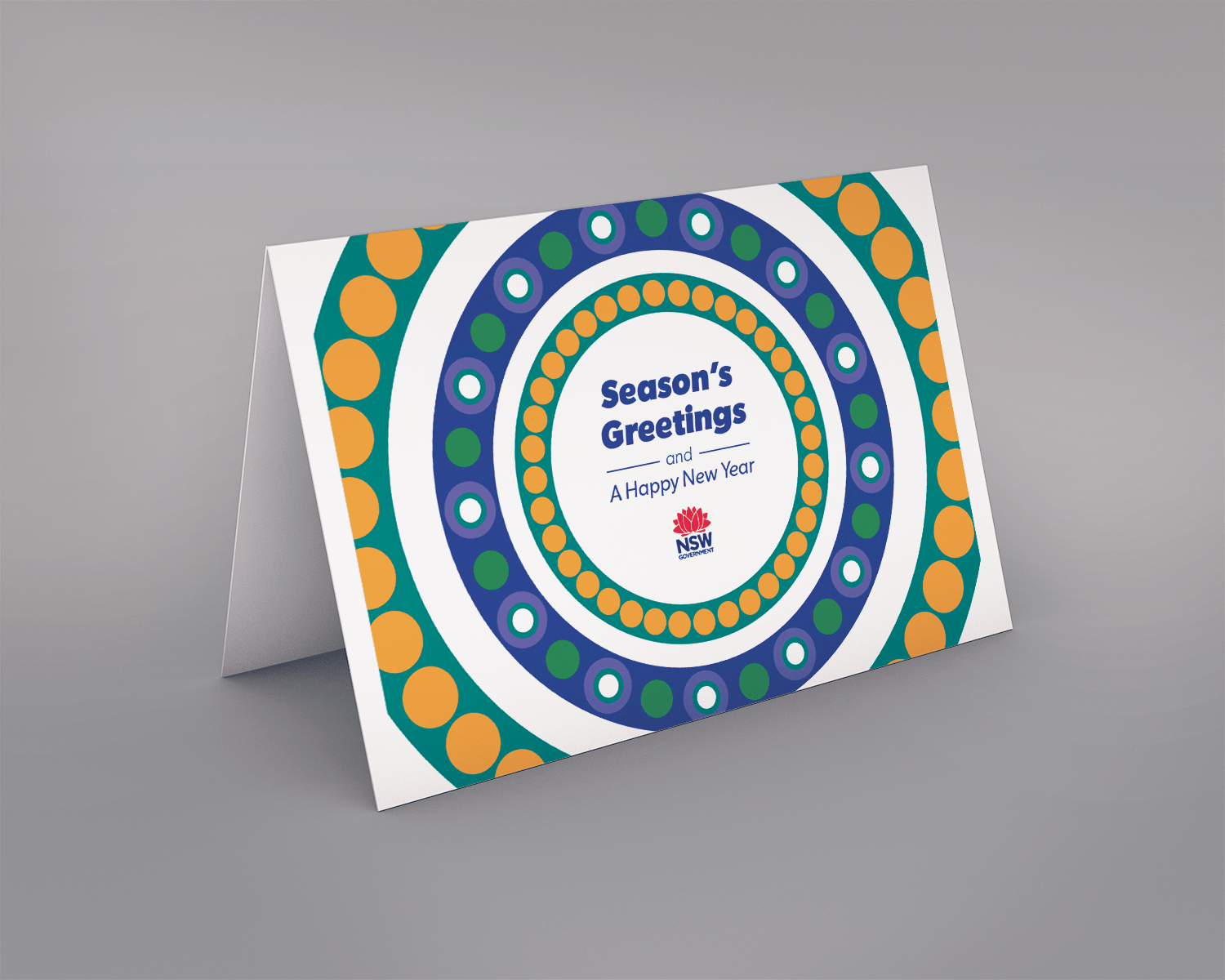
The Aboriginal Communities Lands and Infrastructure Program team had commissioned Indigenous artist Jordan Ardler to produce a painting representing NSW. From that painting, they wanted to create a brand for their team — but had been unable to find an approach or designs they were satisfied with.
My approach was to extract the strongest motifs from the painting and develop a cleaner visual style that could sit alongside the existing Department of Planning brand without competing with it. The final designs became a variant branding style adopted across the entire Department — used in presentations, reports, business cards, and online.
The work is on the page because the artwork is. Crediting Jordan Ardler felt like the only way to present it properly.
The Home Show stand
In 2018 the Department had a significant presence at the Sydney Home Show — a fully branded experiential stand that included a 360-degree theatre experience. I designed the full suite of materials for it: large-format vinyl banners (2m x 3m) to dress the exterior of the theatre, a set of A2 and A3 event posters, an eDM banner that went out to all attendees ahead of the event, and printed postcard collateral for the stand itself. It was a broad, fast-moving brief — the kind where you're producing across formats simultaneously and everything has a hard deadline.
The rebrand and what it actually meant
When the Department changed its name from the Department of Planning and Environment to the Department of Planning, Industry and Environment, it wasn't just a logo swap. Every touchpoint across a large government organisation had to be updated — templates, signage, documents, email signatures, business cards, presentation files, corporate stationery. I was involved in consolidating the new brand guidelines and presenting them to designers across regional offices, helping to shepherd the new identity into practice. Working at that scale makes you think differently about brand systems — the value of consistency isn't abstract when you're the one responsible for it across hundreds of applications.
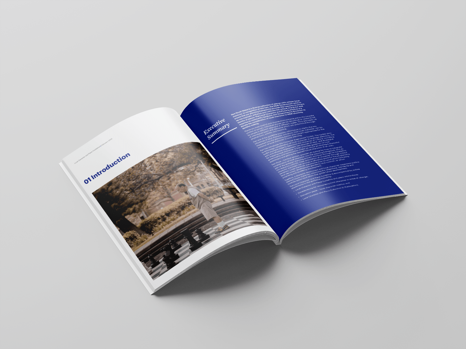
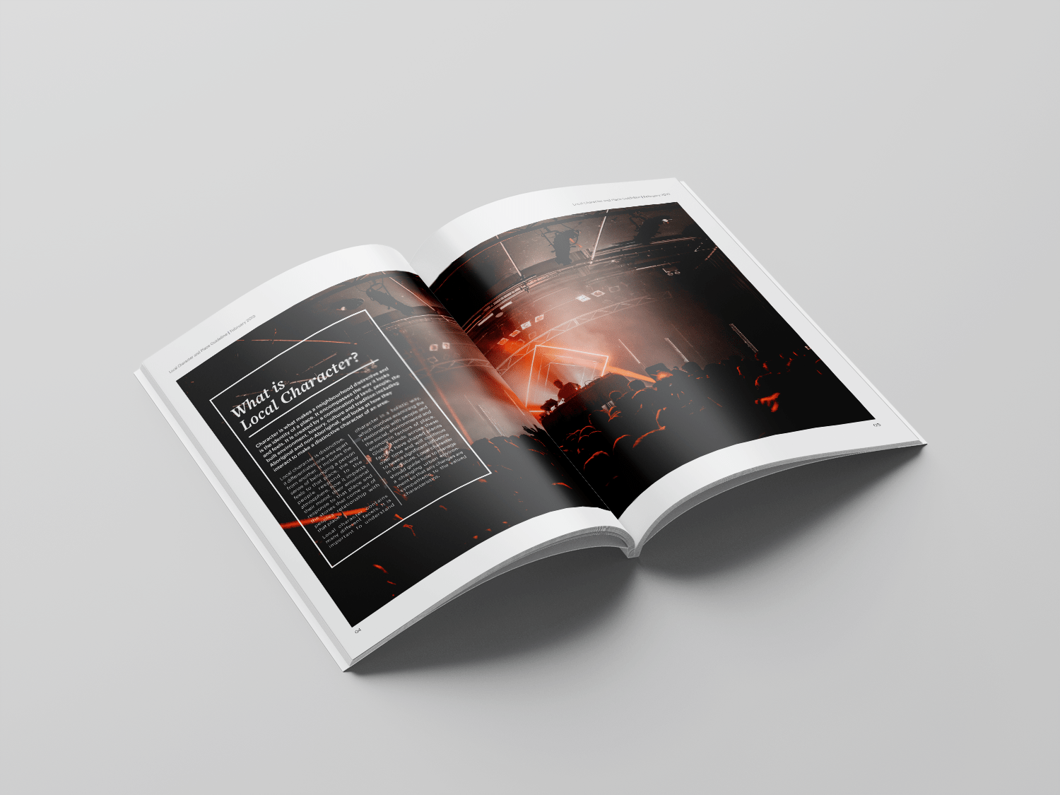
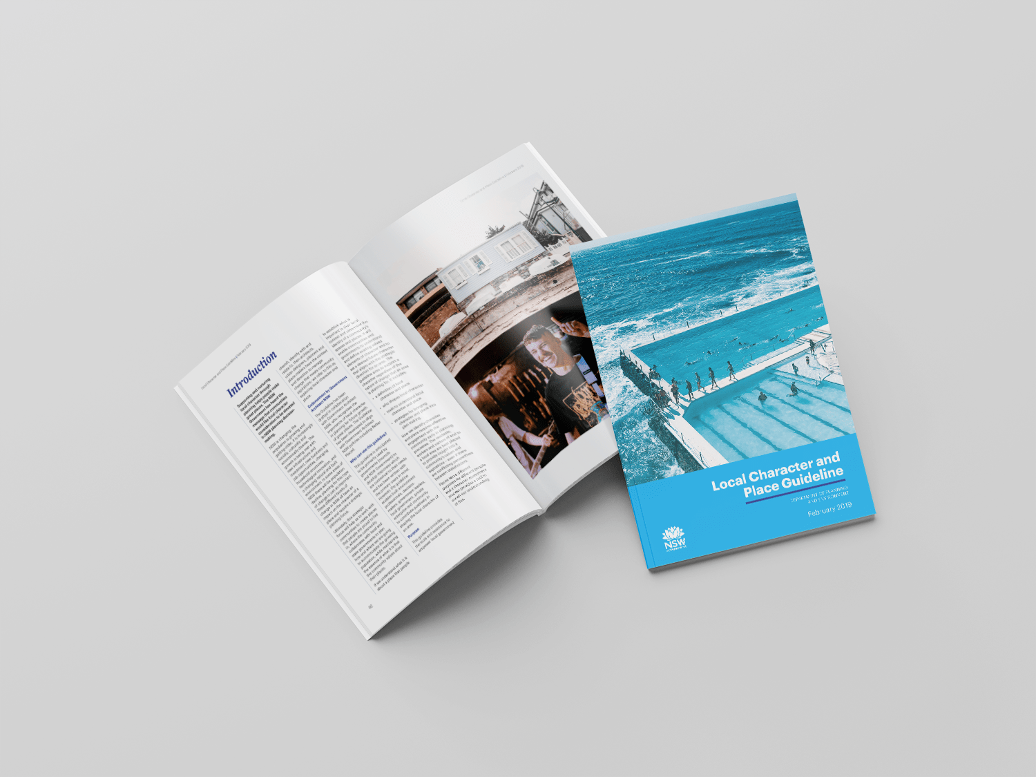
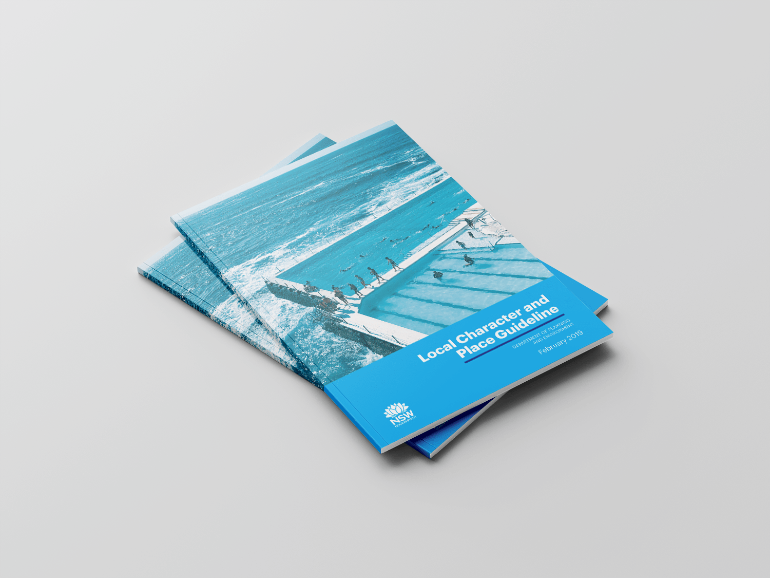
Local Character and Place Guideline
The rebrand and the Local Character and Place Guideline arrived at almost the same time. After the state election of 2020, it was clear the Department's identity would shift and that new design requests would follow quickly. One of the first was a booklet for the Local Character and Place Guideline — a fresh look, needed within 24 hours.
The challenge wasn't just the deadline. We were working within a brand identity that was itself in flux, which meant producing complementary concepts that could hold regardless of where the identity landed. We delivered multiple options that worked as a coherent set — and the response, from all levels of the Department, reflected that.