On a Hiding to Nothing: Rebrands and the Internet Pile-On
Redesign a famous brand and someone will call it the worst of all time. Usually they’re wrong.
Who would want to redesign a long-established, well-known brand? You’re on a hiding to nothing, really. The latest example is Instagram, which has updated its wordmark. That’s the one at the top of the app, playing second fiddle to the camera icon we all know. As with most rebrand launches, the reaction has been completely overcooked.
You could argue for and against the old logo set in Billabong. It was always more than slightly daggy. Instagram kept it long after the app had outgrown its skeuomorphic origins, which made it somewhat unique, if incredibly dated. The new one feels more like a Meta fit, a more modern logo, but I think they’ve tried to do something with it, and the furore from all corners of the internet speaks to that. It’s a little chopped in places, and some people read it as Insta-gasm. Ultimately I think it’s fine, and with a brand this size, fine is sometimes the best you can hope for.
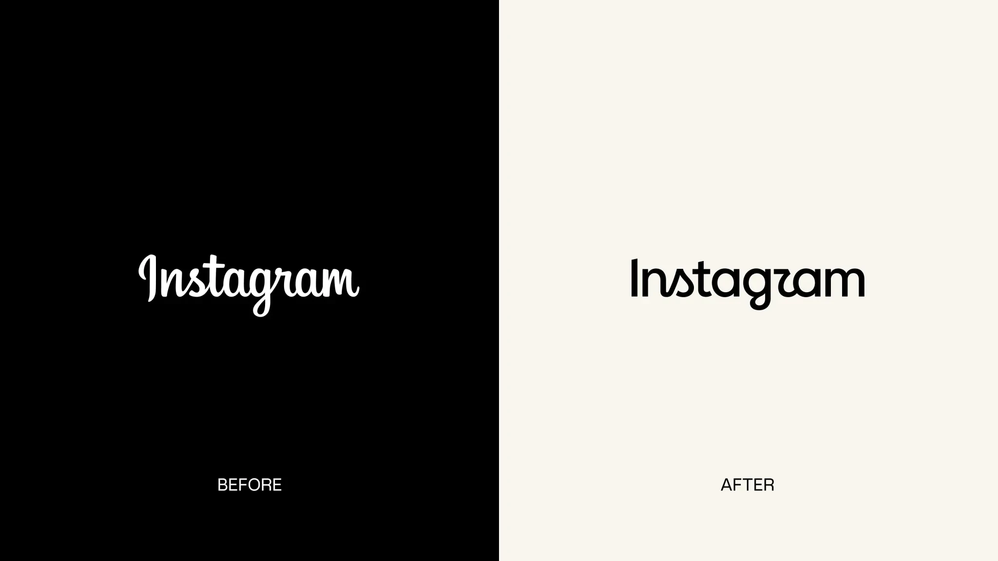 The old Billabong wordmark on the left, the new one on the right.
The reactions have been exhausting. People boil the whole thing down to a couple of words here and there. The teams on something like this are huge, and the hours that go into it would be gargantuan, yet a few words on Twitter can pull the whole thing down.
It’s been that way for a while. I think it started when Gap infamously tried to update its logo and shrank its famous blue square into the corner. It didn’t go well. The horrified public made its distaste known, and Gap quickly went back to the old one.[1]
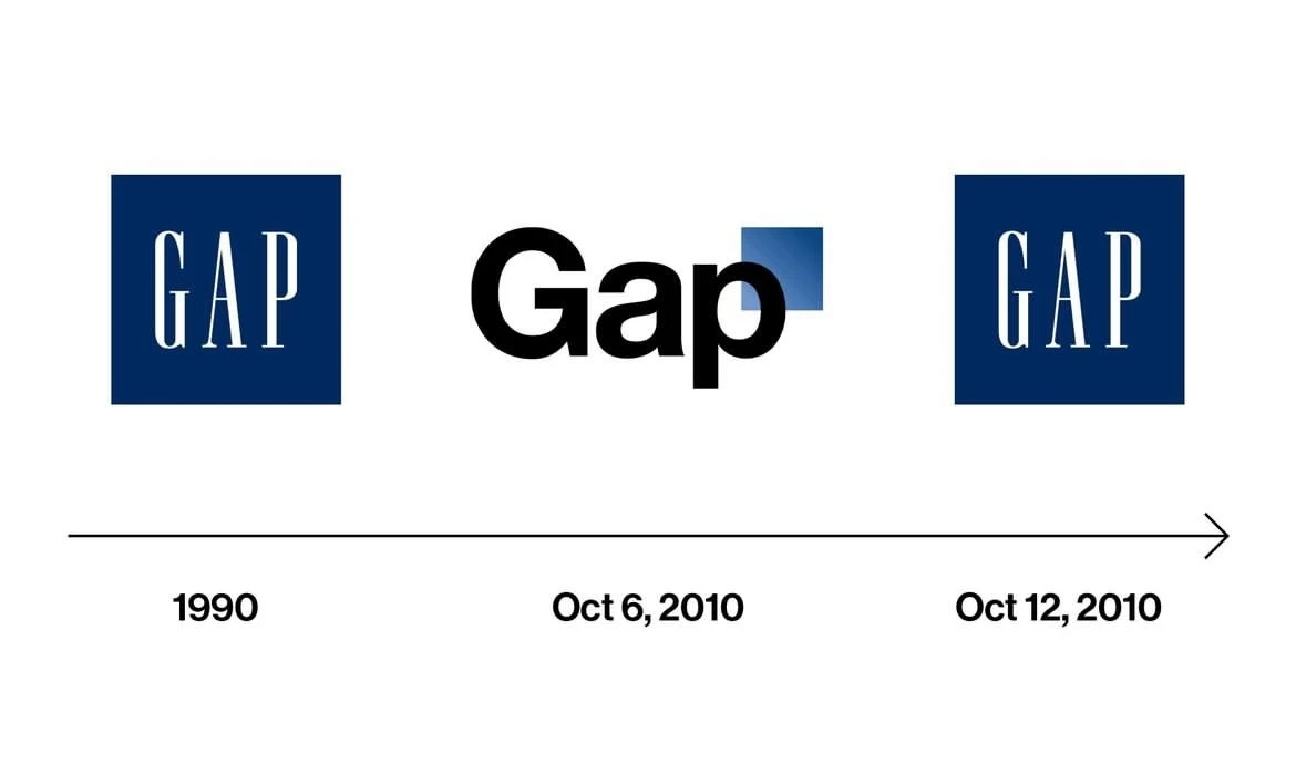 Six days, start to finish.
It’s wild that the instant reaction matters so much. There’s an argument that a logo needs to capture attention and communicate something instantly. But it’s also something that gets set in stone and stays in place for at least a couple of years. In the digital age especially, you need to let people adjust to it, get their heads around it and realise everything will be okay.
The Instagram reaction was interesting, but I mostly let it float away. The one that irked me most this year was Granola.
Granola worked with Ragged Edge on a rebrand that felt more organic and more natural. They admitted the original brand was knocked together super, super quickly in-house, as a bit of an afterthought.[2] That does happen, and sometimes it sticks. The new identity was something they felt was really them.
Then they picked a shade of green that genuinely upset a good deal of people. Some of the tweets I saw were wild. People called it the worst redesign of all time and the most awful design update they’d ever seen, neither of which is remotely true.[3] When you went and checked, most of them were AI startup entrepreneur builder types of some sort.
I think what upset so many of them, tech bros in particular, was that the icon in their Mac dock had turned a more khaki green than they’d have liked. They raised the matter through the proper channels, which is to say Twitter. It was a visceral response from a lot of people to what I believe is really good work.[4]
Look at the overall system and I really like it. It’s part of a wider trend, particularly among AI companies, towards a more organic direction. It moves a brand away from the cold digitalness most AI brands have settled on (yes, I’m looking at you, OpenAI).
Part of the Granola identity by Ragged Edge, green and all.
It’s rare to see a rebrand of a large or beloved company, product or platform where nobody gets offended, even when the changes are minor. There will always be subjectivity, and that’s the best thing about it. To be fair, if nobody got upset and everyone was just okay with it, you’d have a six out of ten on your hands. And what’s the point of a six out of ten?
This also makes me want to touch quickly on a much bigger subject, which is internet discourse and how unbearable it’s become. I said earlier it was exhausting, and it truly is. Whatever the subject and whatever the platform, the comments section is an awful place to be.
We all know Twitter is an absolute cesspool. I’ve used it forever, and I’ve watched the interactions on there deteriorate. I still use it, though I shouldn’t, mostly for design news and football news. I largely keep my football fandom to myself. As a Tottenham Hotspur fan, that’s mainly for my own protection. But go and look at any tweet about football. I dare you to open the replies, where you’ll find the spewings of a festering crew of brain-dead man-children. Whenever I fancy a good eye roll, I know where to go.
At the heart of it is communication. Too much of it is antagonistic shtick, or was never meant to be two-way in the first place. People talk at each other, mostly just trying to shit on each other. It feels rare to see a genuine two-way exchange, an open conversation where nobody is trying to upset anyone.
I should stop there, because it’s a huge topic. Why the internet is this way, and why we talk to each other like this now, is a sad post of its own. Maybe I’ll write the counter post instead, about all the good things on the internet. We’re never going to get away from it. It’s here forever, just like branding is.[5]
This was October 2010, and the new logo lasted six days. In the meantime Gap asked the public to send in their own designs, which is a brave thing to ask the internet. ↩︎
In the words of Sam Stephenson, Granola’s cofounder and designer, it “was thrown together in a few frantic days, and it showed.” The video in their post goes into more detail. ↩︎
A small sample, if you have the stomach for it: one, two, three, four and five. ↩︎
According to Ragged Edge, Granola trended at number one on X on launch day. Whether that’s a win is a matter of opinion. ↩︎
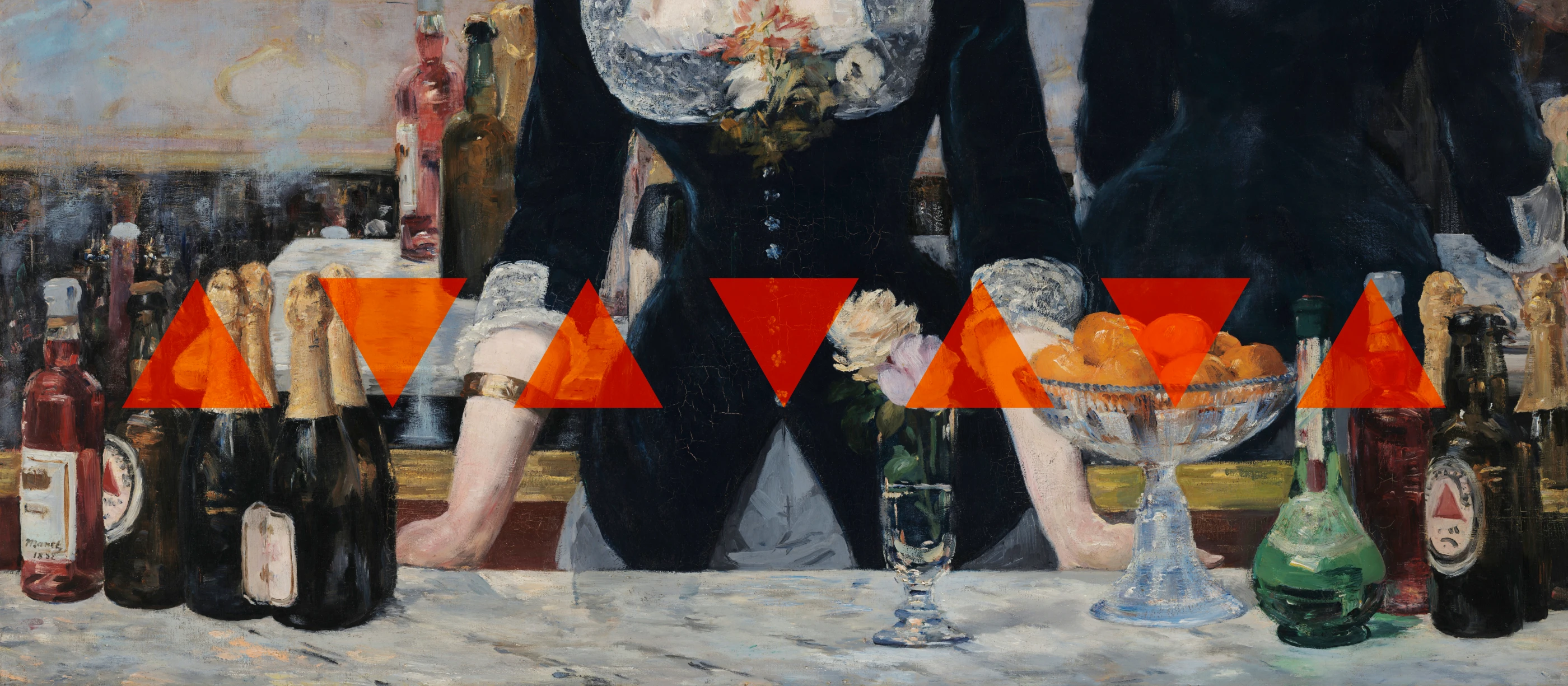
The cover is a detail from Édouard Manet’s A Bar at the Folies-Bergère (1882). The red triangle on the bottles is Bass Pale Ale. Michael Johnson explains in Branding: In Five and a Half Steps that Bass sent a young man to be first in line on 1 January 1876, when the Trade Mark Registration Act came into effect, so the triangle became one of the first registered trademarks in the world. It took no workshops or focus groups. ↩︎