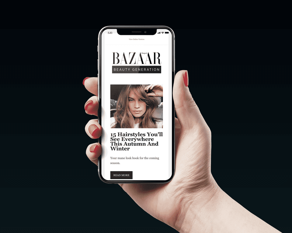
Beauty Generation is a weekly Email newsletter by Harper’s Bazaar AU. As the name suggests, it focuses on the latest trends, treatments, products and news dominating the global beauty industry.
They needed a logo for the sub-brand that complimented the original Harper’s logo, but also stood out. Because the Harper’s Bazaar brand is so strong, I knew there wasn’t a lot that I could or needed to do to produce something that would work.
I tried different approaches looking at font styling, variations, boxes and lines. The first concept I created ended up being the preferred direction.
It is a simple sans serif font (Gotham) tracked wide, set in all caps and placed in a black box. A fairly standard approach, but one that suited the needs of the Beauty Generation and Harper's Bazaar brands.
My next challenge was creating a few simple animation ads for the newsletter. I kept things elegant and simple to match the brand and incorporated a few logo variations that came from my original concepts.

Below are some of my intital concepts.
