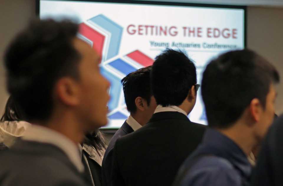
At the Actuaries Institute, I worked as a Digital Media Specialist and later as the Brand and Content Manager. My responsibilities covered brand, graphic design, video, motion graphics and content marketing strategy across the Institute’s web properties. It was one of my first experiences of working with a defined and segmented audience.
Below are some key projects from my time there.
Actuarial Sprint App
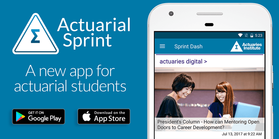
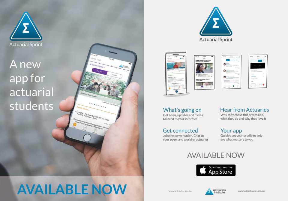
At short notice, I was tasked with creating branding and marketing collateral for Actuarial Sprint, a new app aimed at Actuarial students.
For the logo and primary identity, I wasn’t able to stray far from the Institute’s master triangle logo. After a few iterations that weren’t working or were considered too removed, I took inspiration from Instagram’s then recent rebranding, applying a gradient to a rounded triangle around a line version of the triangle. This kept the connection to the master brand, but created something fresher and relaxed in appearance.
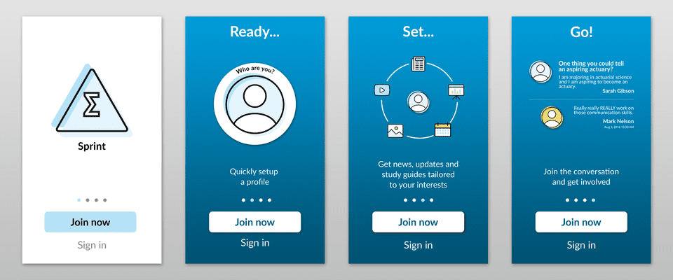
I created imagery for the app itself, in particular the onboarding screens, promo videos, web graphics and print flyers for use at events across universities and colleges. These all went towards driving engagement with the app.
Events Branding
One of my biggest responsibilities in my role as brand manager and designer was producing identities for the multiple major events held every year.
I aimed to move away from the static, outdated stock imagery that frequently failed to communicate the key themes of the events.
My approach was to use adaptable, modern, and meaningful shapes that lend themselves to multiple touchpoints, and stood out from similar events.


Big Data Campaign
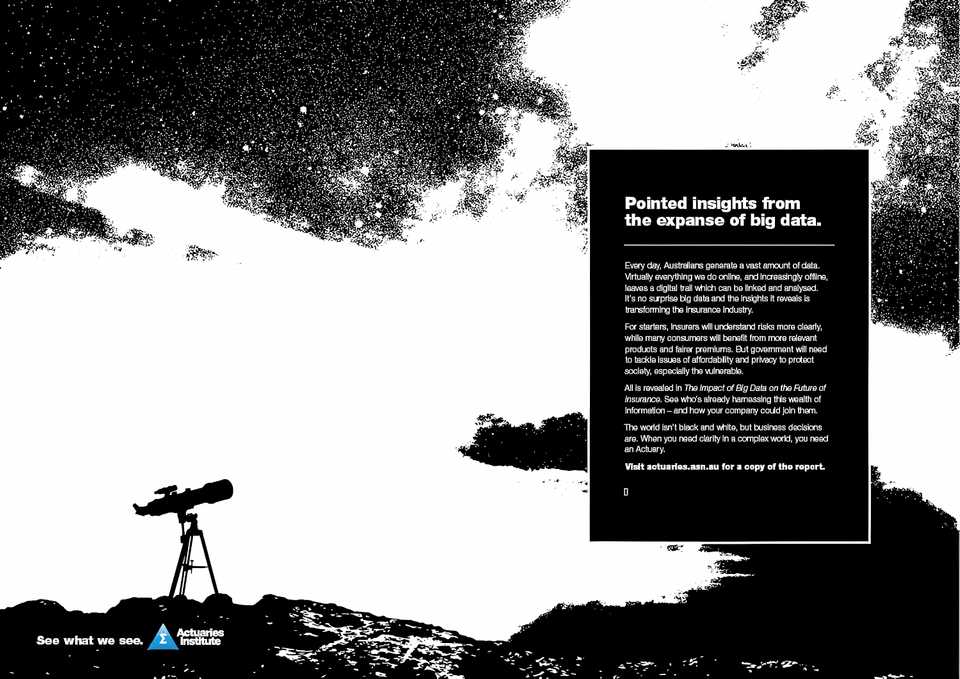
In late 2016, the Actuaries Institute released a Green Paper on Big Data and the impact it will have on the insurance industry.
We tied the paper launch in with our major ‘See What We See’ campaign and used imagery created by our marketing partners.
I several roles across the rollout of this project, including:
- Art direction for the Green Paper itself
- Web page layout and design
- Leading and overseeing the conception and production of four short videos/animations of contributors explaining the key themes of the paper
- Repurposing existing artwork for print, video, and numerous digital applications
The result was multiple unique variations of the original artwork, a powerful set of concise videos and an elegant Green Paper that suited the topic. All of this helped the Institute achieve its most successful and most visually accomplished paper launch.


Logo Animation
The animation is super simple, but for me, this is an example of spotting the opportunity to reinforce brand identity across a vital touchpoint.
At the Actuaries Institute, the need for video content was growing, but with no consistent branding was being applied. Using After Effects, I quickly produced a short ident to be used to bookend the videos being made.
This was the first thing I produced at the Institute and overall the most used.