
The Actuaries Institute
The Actuaries Institute is the professional body for actuaries in Australia. I joined as a Digital Media Specialist in 2016 and was promoted to Brand and Content Manager — covering brand, graphic design, video, motion graphics, and content marketing strategy across the Institute's web properties.
One of the defining features of the role was the audience: actuaries work across insurance, finance, superannuation, and consulting, at every career stage. That diversity shaped how we worked — content had to be targeted and dynamic, tailored to where someone sat within the membership rather than broadcast to everyone the same way.
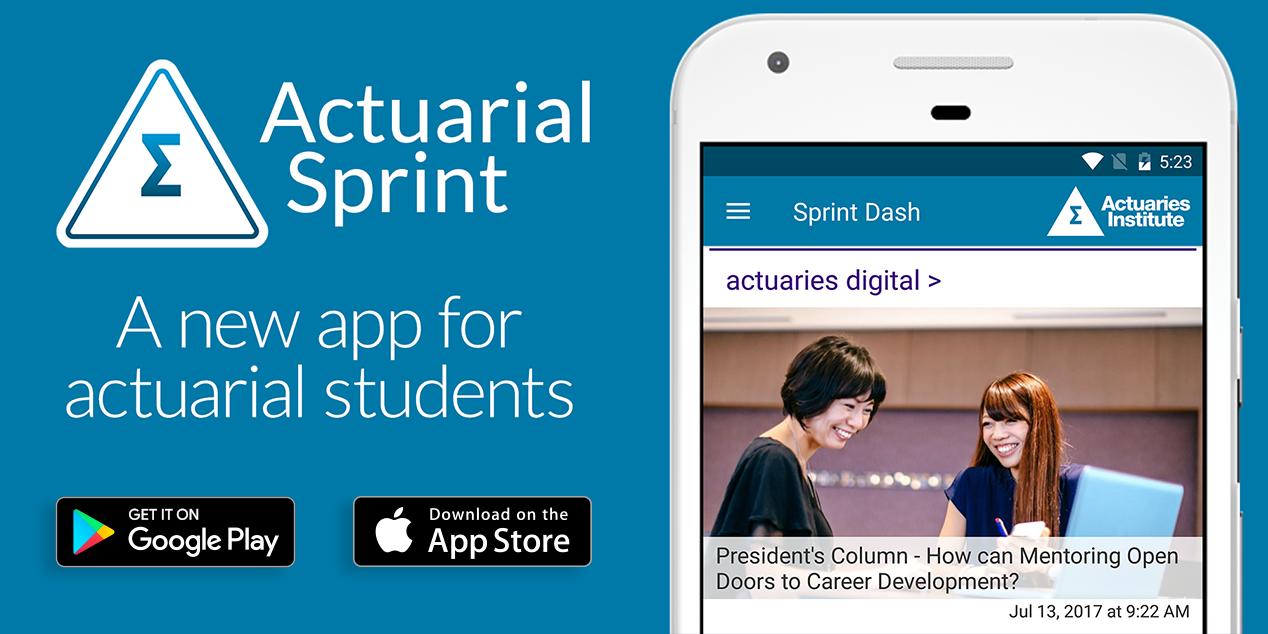
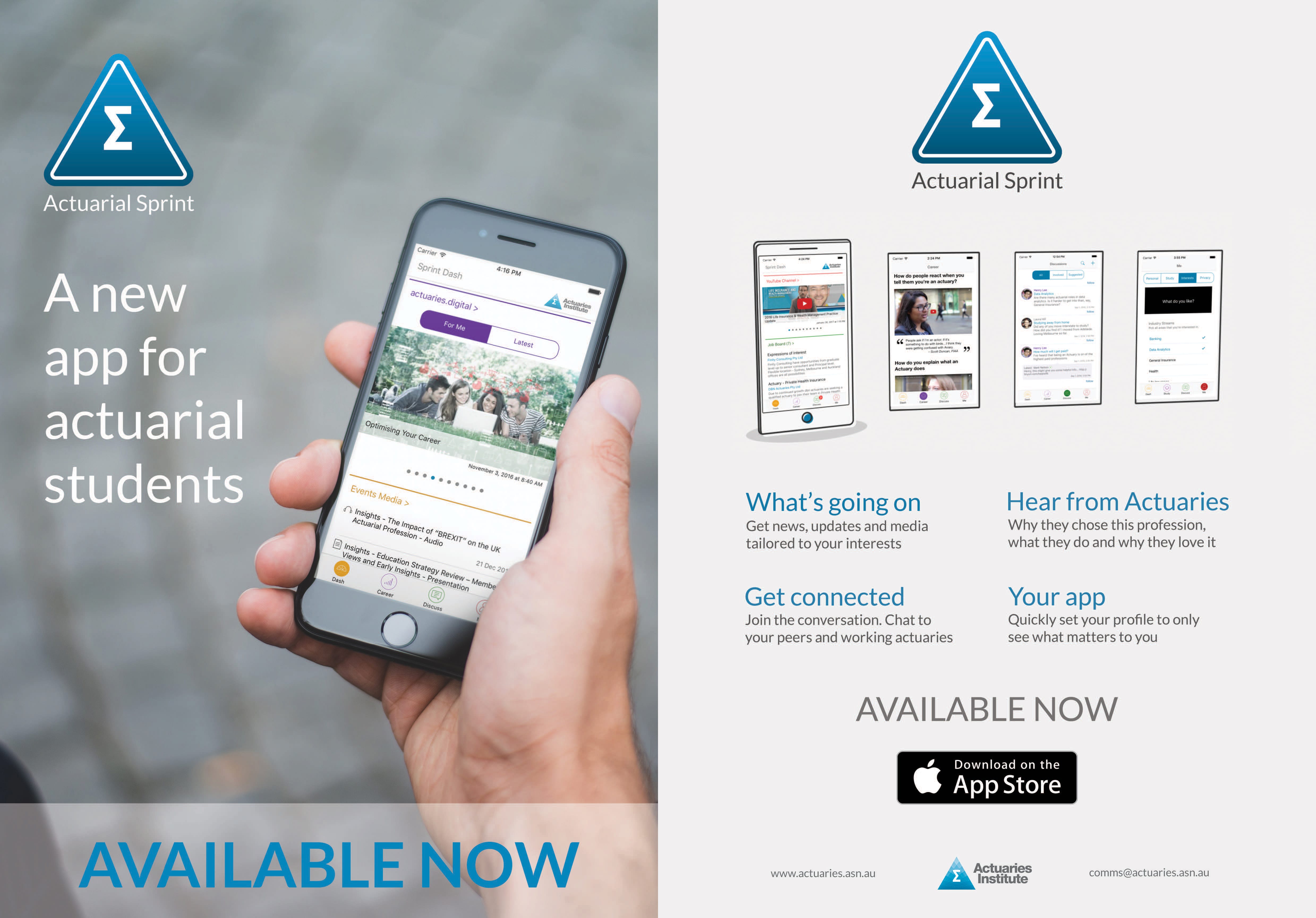
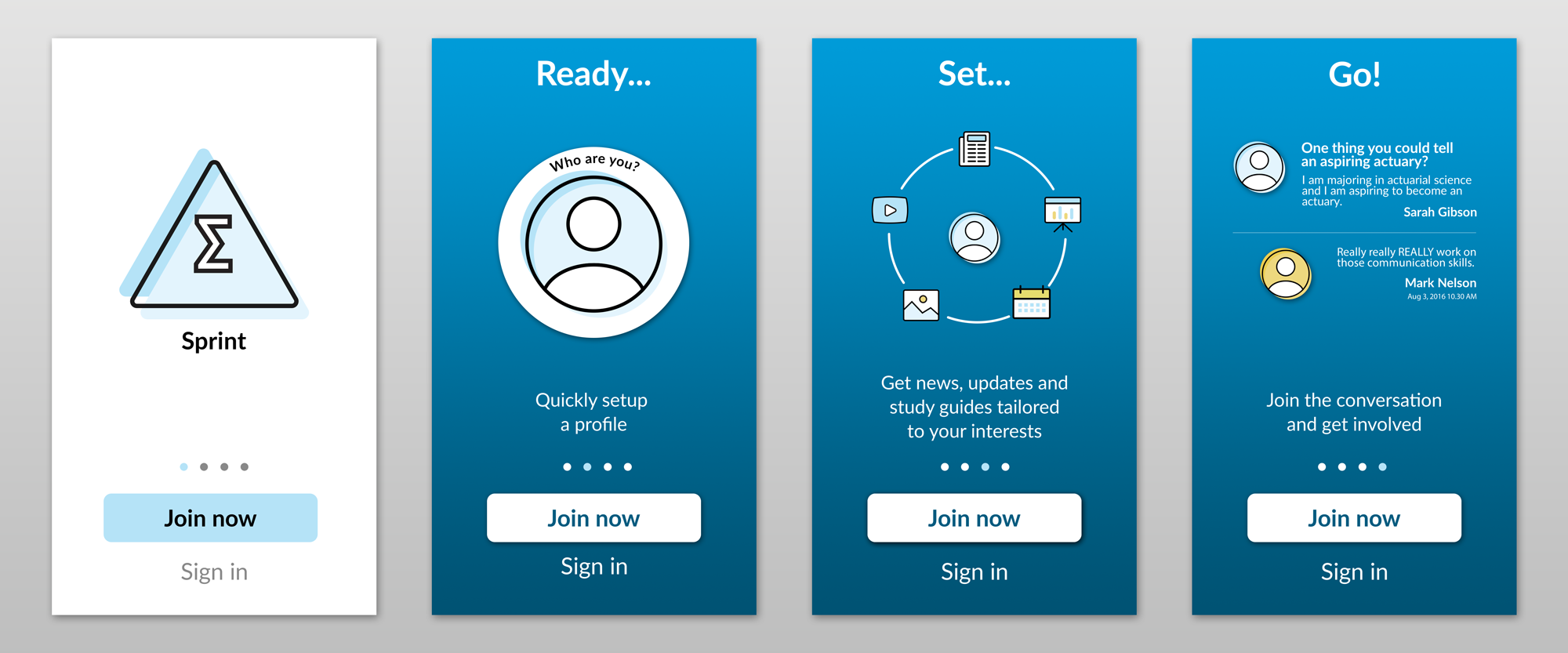
Actuarial Sprint App
At short notice, I was tasked with creating the branding and marketing collateral for Actuarial Sprint, a new app aimed at actuarial students. The logo had to stay close to the Institute's master triangle — a few early iterations strayed too far, and I pulled them back, applying a gradient to a rounded triangle version that kept the connection to the parent brand while feeling fresher and less formal. I followed that with onboarding screen imagery, promo videos, web graphics, and print flyers for university and college events.
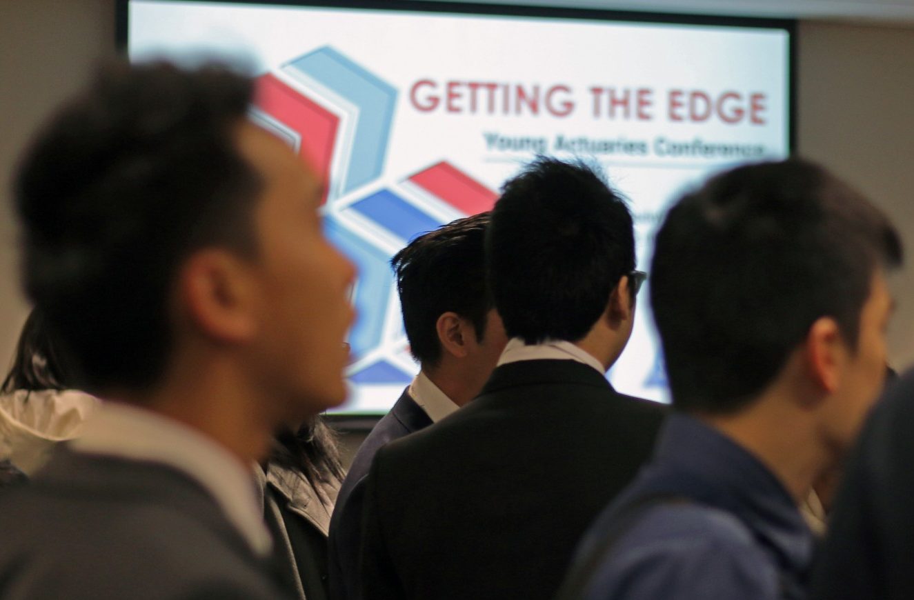
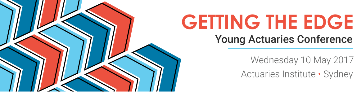
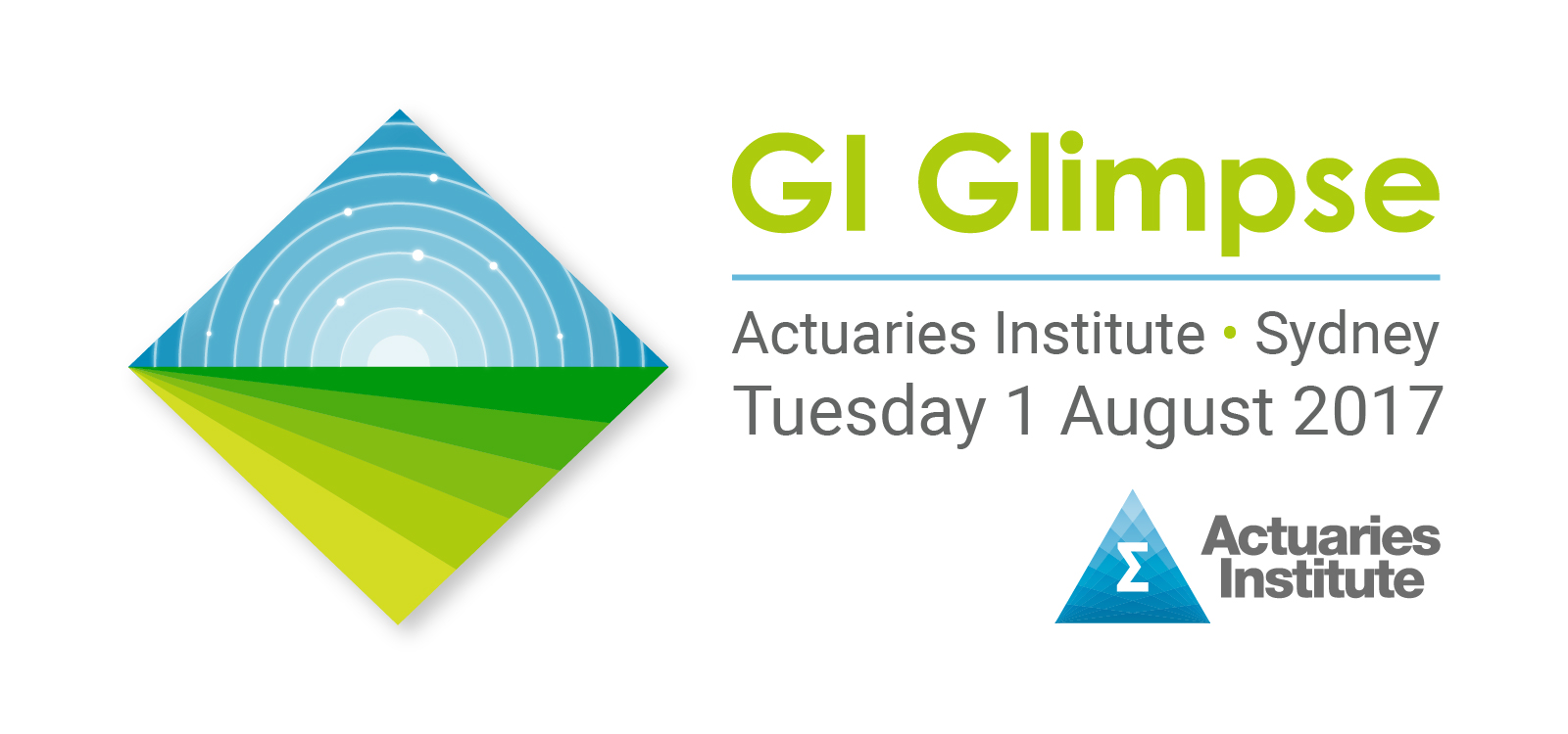
Events branding
A core responsibility was producing identities for the Institute's major annual events. I moved away from the static stock imagery that had been the default — developing adaptable graphic shapes that could flex across multiple touchpoints and actually reflect each event's themes rather than just decorate them.
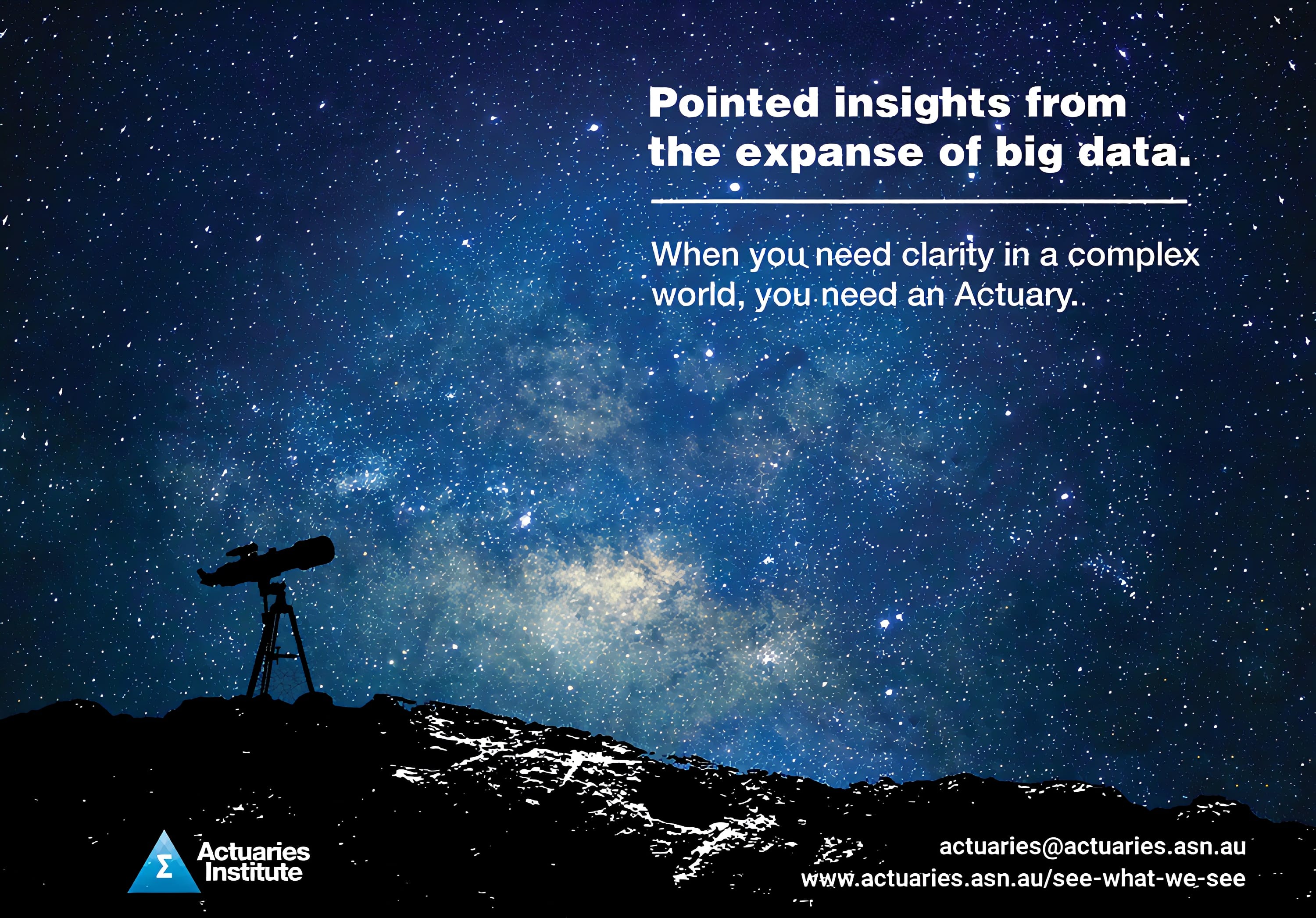
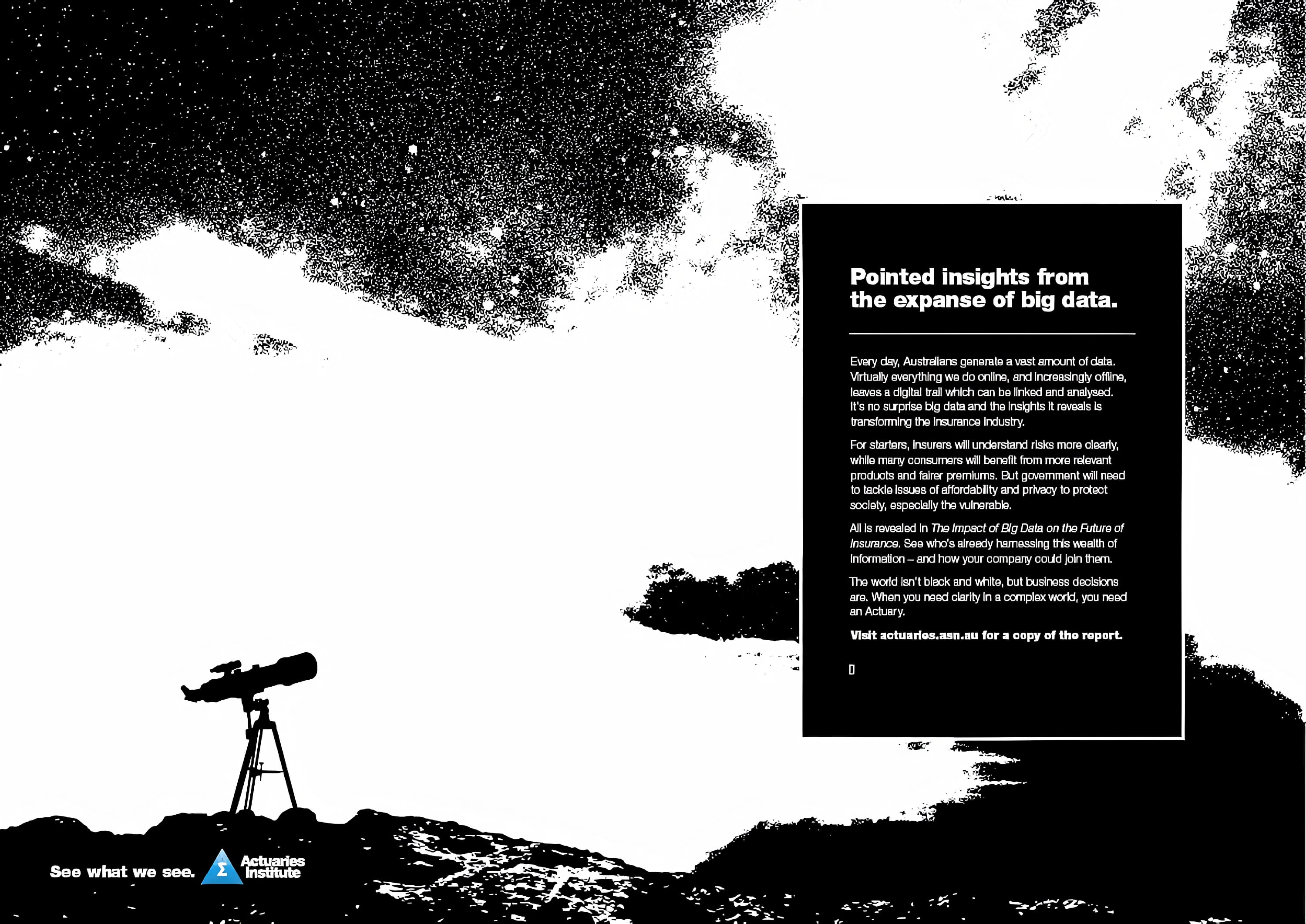
Big Data Campaign
In late 2016, the Institute released a Green Paper on Big Data and its impact on the insurance industry, tied to the major 'See What We See' campaign. I played several roles across the rollout: art direction for the Green Paper itself, web layout, and leading the production of four short contributor videos explaining the key themes. For the broader campaign, we partnered with Ogilvy — I managed that relationship, working with them on the creative and advertising elements alongside the in-house work.
It was the Institute's most successful paper launch — the largest print run of any paper they'd produced, with more activity around it than any previous release. And their most visually accomplished.
Logo animation
The first thing I made at the Institute, and ultimately the most used. Video content was growing with no consistent branding applied to it — I spotted the gap and produced a short ident in After Effects to bookend every video being made. Simple, but the kind of thing that compounds quietly across everything that comes after it.